Hand-crafted recipe book
Meghann worked across several Technology areas when she developed a recipe book made with hand-crafted paper.
Brief development
Meghann enjoys baking, which she does weekly, so chose this as her context when asked to develop paper and create a book. She decided that a recipe book would be a useful outcome, particularly for family holidays, specifying that it should be A3 size to allow plenty of space for illustrations while still being easily portable.
Attributes
Meghann first looked at different types of paper and considered the attributes of each example – colour, smell, texture, and trim. She thought about what she wanted her book to look like and how she would create the paper to complement it, coming up with her key attributes – that the paper would be a primary feature of the book and therefore the layout for the cover and inside pages would be open and spacious to allow as much of the paper to show through as possible.
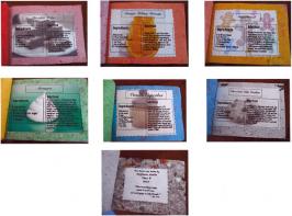
Each piece of paper would be coloured and scented, with Megan choosing the fragrance she felt best suited the colours and textures of the individual sheets. The final specifications for the six pages were:
- green – a flower smell (jasmine) with a rough texture like bark, and rough trim
- yellow – lemon smell, smooth texture, and trim in different shapes
- red – rose smell, texture layered with rose petals
- orange – orange smell, smooth texture with orange circles
- blue – berry smell, smooth texture, long strips of different blues
- purple – lavender smell, rough texture with different purple shades, flower pattern trim.
Making the paper

Sample pages of the book.
Meghann and her classmates planned and developed individual projects, but due to time and equipment constraints worked in groups of three to make their paper. They tore recycled paper into scraps, mixed it in water, mashed the pulp in a domestic food blender and spread it onto mesh in a wooden frame to dry – at which stage each student added the colours or decorative materials they had specified.
The results varied, Meghann says, depending on the amount of pulp used in the mixture and the choice of colours. She found that her first pieces of paper were the best quality, thicker, and more durable, because there was more pulp left in the mixture. The grey, orange, and red paper looked more striking, due to the use of bright colours, while the other results were disappointing. Meghann says that the blue was faded on the sides of the paper "and was rather an ugly shade", while the lavender only had purple bits in the middle and otherwise looked exactly like the grey. Next time, if she wanted brighter colours, she wouldn't add as much white to the mixture.
Paper evaluation
Meghann formally evaluated her six papers in terms of how effective they looked, whether she would modify them and how, and the overall success of each outcome. She also asked six different groups of people to examine one paper each and tell her what they liked, disliked or would change. Meghann had also constructed a piece of paper made from newspaper, with "chunks" of text showing through. She liked this paper and thought that it added a "really cool" effect, but because it was made towards the end of the project she didn't have time to consult her stakeholders. She decided that this paper would make an effective back cover for the book.
Because she wanted a "rainbow" book with different coloured pages, Meghann kept some of her own pieces and traded the rest with classmates for pages in colours she thought better suited her book design.
Recipes
Meghann trialled some recipes at home, and was able to work in the Food Technology workroom during school time to do more baking. After trying different recipes, including old favourites as well as some she hadn't baked before, Meghann decided on the content of her book: chocolate chip biscuits, vanilla cupcakes, gingerbread, chocolate fudge, orange melting moments and meringues.
Cover design
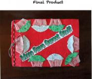
Before starting her own development, Meghann looked at different book covers and analysed why she liked them, considering aspects such as colours, images and layout. She sketched some concept designs for her own book cover and consulted some teachers and classmates. Based on their feedback and preferences, she chose a concept to develop further, incorporating some of the features from the less-favoured concepts.
Meghann consulted her stakeholders again, asking them which designs they preferred and why, before developing her final design. Her stakeholders all liked the final design, while suggesting a few things that could be changed. However, Meghann decided that she was happy with it and would keep it as it was.
Inside layout
Meghann sketched three designs for the inside layout, each showing placement of the title, ingredients and method. She preferred one design and stakeholder consultation confirmed this as the one to use. With the layout established, Meghann then created three versions of each recipe and asked her stakeholders which illustrations they liked best. She considered their responses and her own preferences before deciding which she would use.
Binding samples
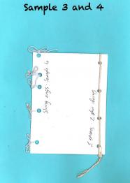
Before assembling the book, Meghann made samples of six different binding techniques she could use: PVA glue, staples, spiral binding, and three types of string binding. She concluded that tying lots of small holes together with string was the neatest and the strongest effect. When making her final outcome, however, Megan used elastic covered in silver instead of string, to give the book a "glittery effect".
Meghann says she is extremely happy with her book and wouldn't change a thing: "It is satisfying to see it all finished!"


