Top scholar DVC
Samuel Blok from Waiheke College took the 2011 Top Scholar in DVC with a three-part project that included a transformable apartment design, a matching piece of furniture and a visual presentation.

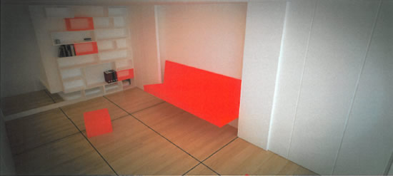
Apartment design 3.

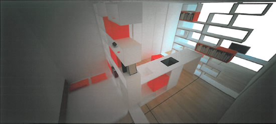
Apartment design 2.
The brief
The first component of Samuel's project was to design an apartment with transformable elements to suit the specific needs of an imagined client. Samuel's design must maximise the use of the 32 square metre space limit and show the influence of his preferred designers in its aesthetic.
The second component of this brief was to design a piece of furniture for the apartment that could transform to have two different uses and integrate flawlessly with the apartment's functional and aesthetic qualities.
The final component was to create a visual presentation of these designs that would be displayed in the Waiheke College foyer that would make informed use of layout, typography and media and communicate the key concept of transformability to the target audience.
Apartment Design
Samuel refined his brief based on the preferences of his client, a recent design graduate from Auckland University of Technology (AUT).
My client wanted me to design him an apartment in the CBD of Auckland. The space needed to be functional and creative, so that he could draw inspiration from it, Samuel explains, and it needed to easily transform between a home and a work space and be ordered to contrast with the busy city life outside. The client also showed a preference for designer Yuko Shibata who incorporates elements of the De Stijl art movement in his work. The client also has a love of media and wants enough space to store display and view books, movies and pictures.
Aesthetic specifications:
- Clutter-free minimal aesthetic with clean lines.
- Restricted use of strong colour.
- Use of asymmetry.
Functional specifications:
- Strong use of natural light.
- Space for the work desk.
- Space for watching movies, displaying books.
- Easily transform from work space to leisure space.

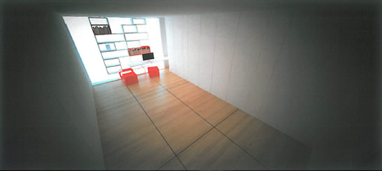
Final design 1.
Research
Samuel immediately looked into the work of Yuko Shibata to provide a guiding aesthetic throughout the project. As Shibata was heavily influenced by the De Stijl art movement, Samuel also familiarised himself with many of its fundamental aspects to inform his design decisions, particularly the strong use of square lines with small, but bold, splashes of primary colour.
The apartment also had to function as an everyday home so Samuel began looking into furniture and appliances that would use space efficiently, such as combined washer-dryers and drawer dishwashers.
Samuel then researched the materials that would form the walls and windows for the apartment. Samuel weighed up the pros and cons of tiles, glass, concrete and steel, taking into account the different ways each material would reflect light or create a feeling of warmth or coolness in the small space.
Concept drawings
Samuel then created four concept drawings to explore different ideas for the apartment's design such as curved walls, foldable dividers and movable shelving units that would create a variety of functional areas within the small space.
Samuel used an array of different tools and media to visualise these ideas, often integrating several techniques in one image. He started with basic hand drawings which he then rendered in Photoshop so they could be easily manipulated and built upon with photographic images to give more realistic textures.
Adobe Illustrator was used to create 2D design schematics giving precise dimensions of functional aspects such as moving beds or walls, as well as for floor plans that demonstrated traffic flow and light placement.
Samuel then used Google SketchUp to create 3D models of each of his apartment concepts, which provided multiple views of the entire space. He then used V-Ray rendering software to turn these models into beautifully textured, photorealistic 3D environments.

Final design 2.
Final apartment design
Samuel incorporated the most successful elements from his concepts into a final design. The key transportable element of his apartment design was a system of movable book shelves. Inspired by traditional Japanese Shoji panels, the shelves work as dividers, creating three different modes for the apartment: a bed/kitchen and workspace mode; open/client consultation mode; and a theatre/lounge mode.
The shelving system uses a series of detachable 'Lego brick' style boxes that hang on a frame connected to mechanical rails in the ceiling and floor. This means that the shelves can be fully customised to suit the client's functional or aesthetic demands and be shifted across the length of the room to create the different modes of the apartment.
The book shelves define separate spaces yet allow natural light to filter through the apartment. The rectangular lines create an ordered, clutter free aesthetic which is repeated in the storage panels along the length of the apartment plus the grid on the floor created by the tracks for the bookshelves. Repeating these clean, linear lines through the apartment creates a sense of unity and calm throughout. The customisable Lego brick style shelving units add asymmetry and innovation to the space and allow furniture to be stored there when not in use.
The transportable nature of the apartment is enhanced with a kitchen unit and couch that can be folded completely into hidden cupboard space in the wall when not in use. Samuel chose translucent Perspex for all of the wall cupboards so that internal lights within could help carry light throughout the space.
Samuel's colour choices for the apartment also integrated function with aesthetics.
White is the underlying palette of this apartment, however there is room for the client to add his own creative touch. White reflects light, so this will improve lighting at the rear of the apartment. In line with the De Stijl movement, strong colour has been used, but restricted to the book shelves and soft furnishings.
Furniture Design
With the apartment design complete, Samuel now had to create a transformable piece of furniture that would integrate perfectly with the function and style of the apartment. For his final design Samuel created a seat that can be transformed into a stool, an office chair or a lounger, and can be folded completely into a box to be stored in the apartment's shelves when out of use.
Samuel followed the process he used for developing the apartment design, creating several initial concepts from hand drawings through to fully rendered photorealistic 3D images.
Samuel then modelled the design in Illustrator and Google SketchUp, creating a series of hinges and foldable components that made the transformation possible
While Samuel had initially wanted the design to be as comfortable as possible with a headrest and lumbar support, these features had to be sacrificed to make the chair fit into the box shape that would slot into one of the Lego brick shelving units, satisfying the requirement for the chair to be transportable and take up less space when out of use.
To unify the piece with the apartment, Samuel carried the Lego theme into the seat by creating the distinctive circular indents of Lego brick in the cushioning. He also continued the red and white colour scheme in the seat's materials.
Samuel researched materials that would help the chair be both light enough to fold up and put on the shelf and strong enough to support the weight of his client. Samuel chose hollow Perspex to keep weight down, with an interior honeycomb structure for added strength. Dense memory foam was chosen for the cushioning to give maximum comfort while maintaining a minimal profile.

Final design 3.
Presentation Design
The third component of Samuel's brief was to create a presentation of his apartment and furniture designs that would be displayed in the Waiheke College foyer. This required Samuel to combine text and visual imagery that would reflect his designs and sell the product to his client.
To examine the potential possibilities for his presentation, Samuel first visited the site of the presentation, taking photos of the college foyer and surrounding area. He also modelled the floor plan of the foyer in Illustrator to help determine the best areas for human traffic flow.
Samuel then researched different media options such as animations, websites, models and a PowerPoint presentation. After weighing up the benefits and drawbacks of each, Samuel determined that these options would be either too complicated or lack visual impact.
After reviewing the alternatives I decided to use an art board as it is the most effective solution when considering the spatial, production and time constraints of this project. It was easy and relatively cheap to construct with no need for complicated technological knowledge. It also gives a clear visual overview of the entire work and allows for a range of mode and media.
Samuel then repeated the development process, this time looking at different visual aspects and reviewing layouts, fonts and colour schemes to find the right balance between visual and textual information.
This presentation clearly communicates the key features and design ideas of the transformable apartment and seat. It echoes the red-and-white colour scheme developed in the design briefs and both the grid and layout reflect the rectilinear geometric shapes of the design as inspired by De Stijl and Yuko Shibata. Moreover, the minimalist compositional techniques provide clarity of message making this s a highly functional presentation.
Along with the Top Scholar award, Samuel's seamlessly integrated and beautifully presented work project earned him a three-year scholarship from AUT where he is currently studying Product Design.
Teacher comment
"This really is outstanding work. Samuel used a wide combination of tools throughout the project including traditional hand drawing and illustration techniques and Photoshop, Google SketchUp and V-Ray to a very high standard. The environments he created for the final solution looked very realistic," teacher Linda McKelvie says. "Sam was overwhelmed to get the top mark because he always thought students who achieved at that level were just gifted, but he now realises that it's also takes a lot of hard work!"
Linda McKelvie
PDF downloads
Apartment development and final design (PDF, 4 MB)
Apartment final evaluation and design details (PDF, 2 MB)
Furniture materials final (PDF, 824 KB)
Furniture final evaluation (PDF, 3 MB)

